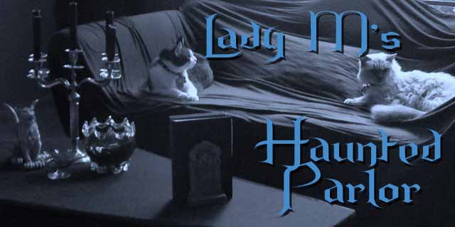
The parlor got an update - ditching the blue and gray in favor of some black and beige. Let me know if you approve or miss the old parlor. How about the new font? Is it hard to read or just annoyingly curly? Anyhow, thought I would do some remodeling for Creepmas which starts tomorrow so stop by the 1st through the 13th for some creepy fun. Looking forward to your visit.


I don't see curly. I see skulls. ;-)
ReplyDeleteBut seriously, maybe title and text should be the same colour. I get a bit distracted when I see way too many shades of the same colour in different places. But that's just me.
Ok - good advice. I made the post title and text the same color. That is less distracting.
DeleteI like the new colour scheme and the new header photo (oooo, that formal bust with a skull, LOL). But I do find the font a bit hard to read for any length of time.
ReplyDeleteHow about this font? It is less curly. I think it is easier to read.
DeleteHee hee - the curlies are too much, Lady M! Otherwise, looking good.
ReplyDeleteOk - Do you like this font? Unfortunately blogger font choices are grossly limited.
DeleteLooks good!!
ReplyDeleteWell thanks Bob!
DeleteI like it!
ReplyDeleteSo glad it appeals to you Mark - but I gotta please the ladies above so the new font "unkempt" is a little less curly than the old font "the mountains of Christmas".
DeleteI like the new one! Looks really good!!!
ReplyDeleteThank you dearest!
DeleteI like it, feels a little warmer, which is nice during this chilly season.
ReplyDeleteYes - it is a good time of year to be warm.
DeleteI've always been a fan of black and beige. :)
ReplyDeleteI am so glad you like it.
DeleteLove it- a bit more of a autumn feel.
ReplyDeleteThanks - I was going for creepy, old fashioned feel but autumn definitely works.
ReplyDelete